UI/UX design
Mobile
SHAF
A sharing economy system that can handle food waste in smart way for single-person households
Duration
3 months
Role
UI·UX designer/UX researcher
Background
After graduating and becoming independent, I started living on my own. Unlike living with family, the biggest problem of living alone is the large amount of food waste. Nowadays, as the number of people living alone is increasing, I realized that many people likely share the same concern. Additionally, with growing environmental awareness, efforts to address food waste are becoming more common. I created this application to help solve the problem of food waste in one-person households.
Process
01
Understand
Desk research
User interview
02
Identify
Affinity diagram
Persona
User journey map
03
Design
Design direction
User scenario
04
Implement
Wireframe
Prototype
Desk research
207g
Single-person household waste
7502M
Single-person households
74.2%
Environmental interest
Insight
As the number of single-person households grows and the proportion of food waste generated by them is the highest among all household types, there is a clear need for services that provide tailored ingredients for this demographic, with environmental concerns driving awareness.
*All the research was done in South Korea.
User interview
I conducted interviews with 27 people to obtain qualitative and quantitative results on the difficulties that single-person households experience in their dietary life.
As a single-person household, have you ever experienced difficulties in dietary life?
Yes 88%
Q1
As a single-person household, what does bother you most in the point of view of dietary life?
- There are too much food waste
- I can't eat the food that I want to appreciate for financial reasons
- Difficult to control the amount of the food when cooking
- Spending increased due to delivery food culture
- I feel lonely when eating alone
Q2
Why is it difficult for single-person households to reduce food waste?
- Food ingredients sold based on consumption of two or more people
- There is no one to share
- Many foods have a short expiration date
- Not enough space at home to store food!
Q3
What concerns you the most when trying food-sharing services for single-person households?
- I'm worried about the freshness
- Wouldn't it be difficult to manage food?
- Many foods have a short expiration date
- I wonder if there will be enough users
Affinity diagram
Based on the answers from user interviews, we identified common pain points and grouped them into three main categories.
Difficulties in managing food fresh
The need for suitable ingredients
The loneliness of eating alone
Goal
Create a food-sharing service based on the concept of a giver and a receiver, enabling users to exchange ingredients with one another in a fresh and safe manner.
Persona
I synthesized the research findings and developed two personas reflecting the insights I gained. This enabled me to more clearly grasp target users and identify the key areas to prioritize in the design process.

Kita | 27 years old | Office worker
Kita, who became a single-person household as she moved away from her hometown after changing her job, started cooking for herself for the first time in her life. However, she was frustrated because there was more food waste than expected and there were no places to store the ingredients.

Ryo | 23 years old | Student
University student Ryo, who became independent while entering university, cooks for the environment even if he wants to order delivery food. However he’s starting to get tired of cooking by himself.
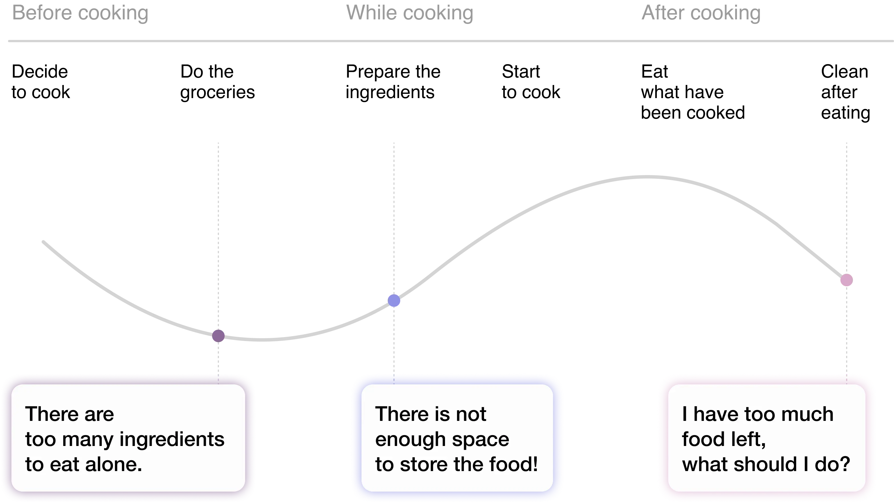
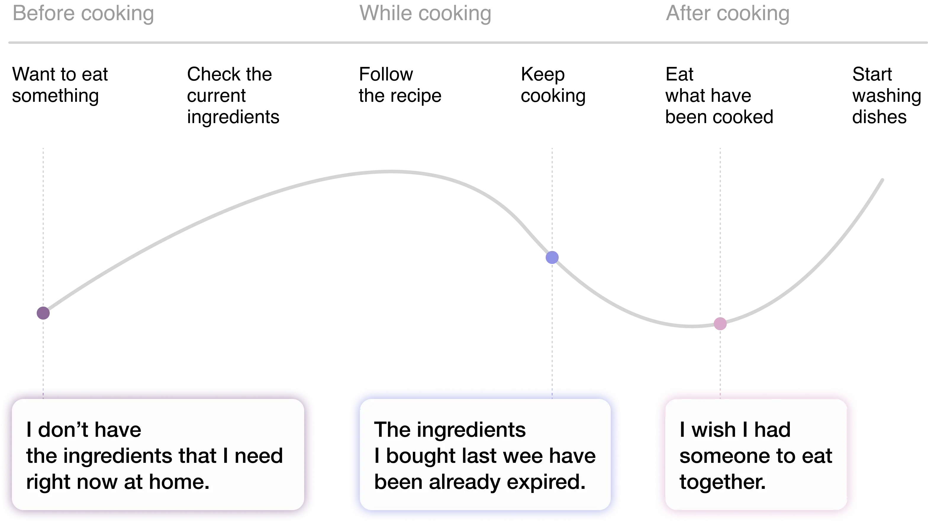
User journey map
I mapped the user journey to highlight key pain points experienced by each persona at different stages. These pain points were then categorized according to the problem areas identified through the affinity diagram.
Design direction
To address the recurring pain points, I established three design principles and developed functions based on these principles.
Pain point
Lack of space to store food
Lots of foods with a short expiration
Food ingredients sold based on consumption of two
Absence of necessary food ingredients
Absence of people to share food with
The loneliness of eating alone
Function
Register food ingredients information to be shared in the app
Fridge accessible only via registered QR code
Report if there is a problem with food
Check the location of refrigerators near me
Real-time checking of refrigerator status with the app
Reward System: Badge #Givers
Sending a thank you message
Value
Fresh and safe
A service that guarantees safety and freshness so that users can use it with trust, since it is a service directly related to dietary life
Real time service
Efficient service that enables real-time check to prevent users from wasting their time
Spirit of sharing
A service that does not simply dispose of food waste, but allows neighbors to practice sharing and show affection
User Scenario
Based on the design concept, I developed a detailed UX flow to ensure that the user journey aligns seamlessly with the core goals of the service. This process involved mapping out each step of the user interaction, from discovering the service to completing tasks like searching for food or receiving shared items.
Wireframe
Before creating the prototype, I designed a wireframe with Figma to lay the foundation for the user interface and functionality of the service. The wireframe served as a blueprint, allowing me to structure the key components of the design, including navigation, layout, and user interactions.
Design Deliverables
Find and share food in real-time
To help users access the ingredients they need without hassle, I introduced a real-time map-based search experience. Instead of browsing through lists, users can now easily locate nearby refrigerators visually and interactively on the map, encouraging spontaneous sharing and retrieval.
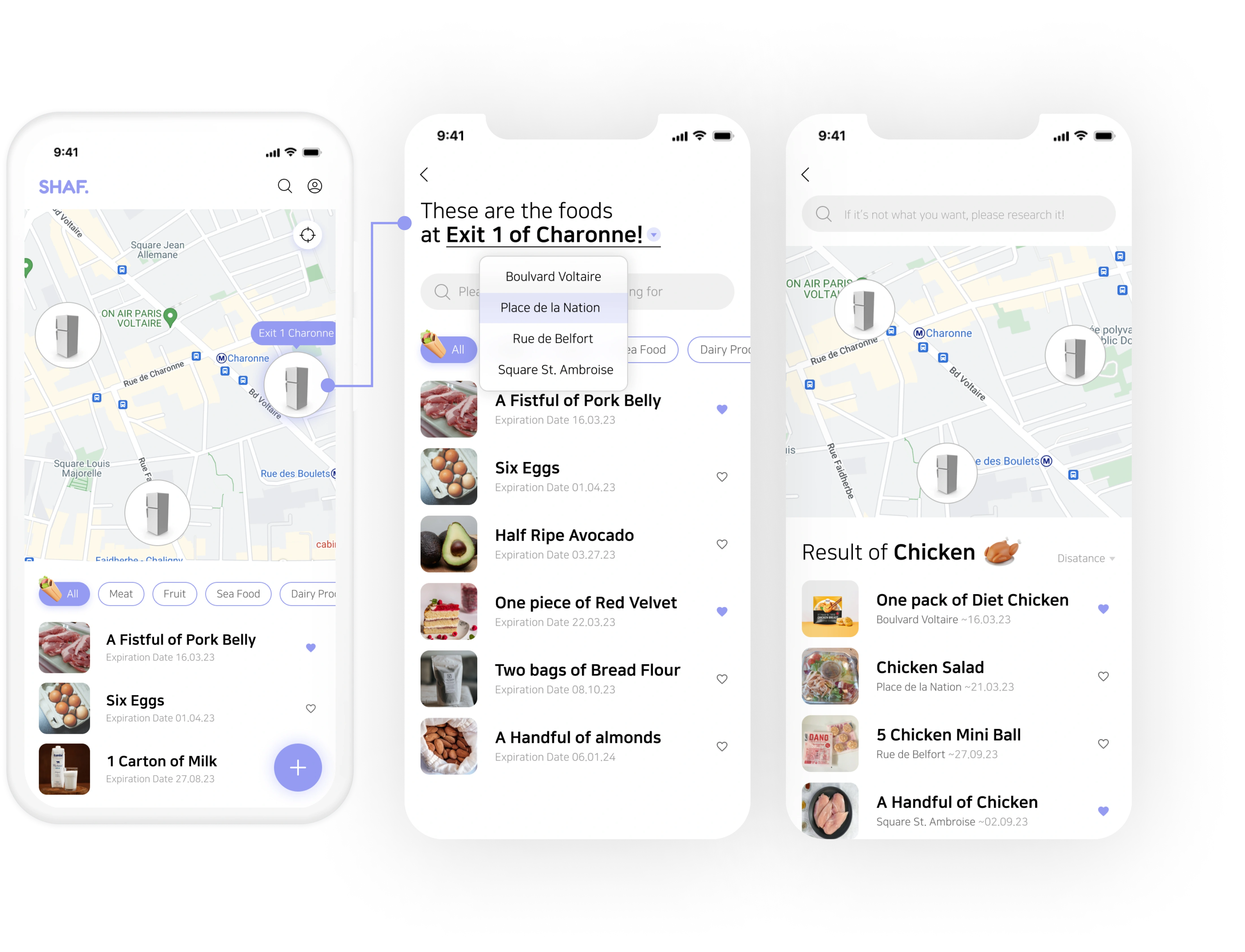
Placing the map on the initial screen that appears as soon as the app is opened enables users to effortlessly achieve their goal.
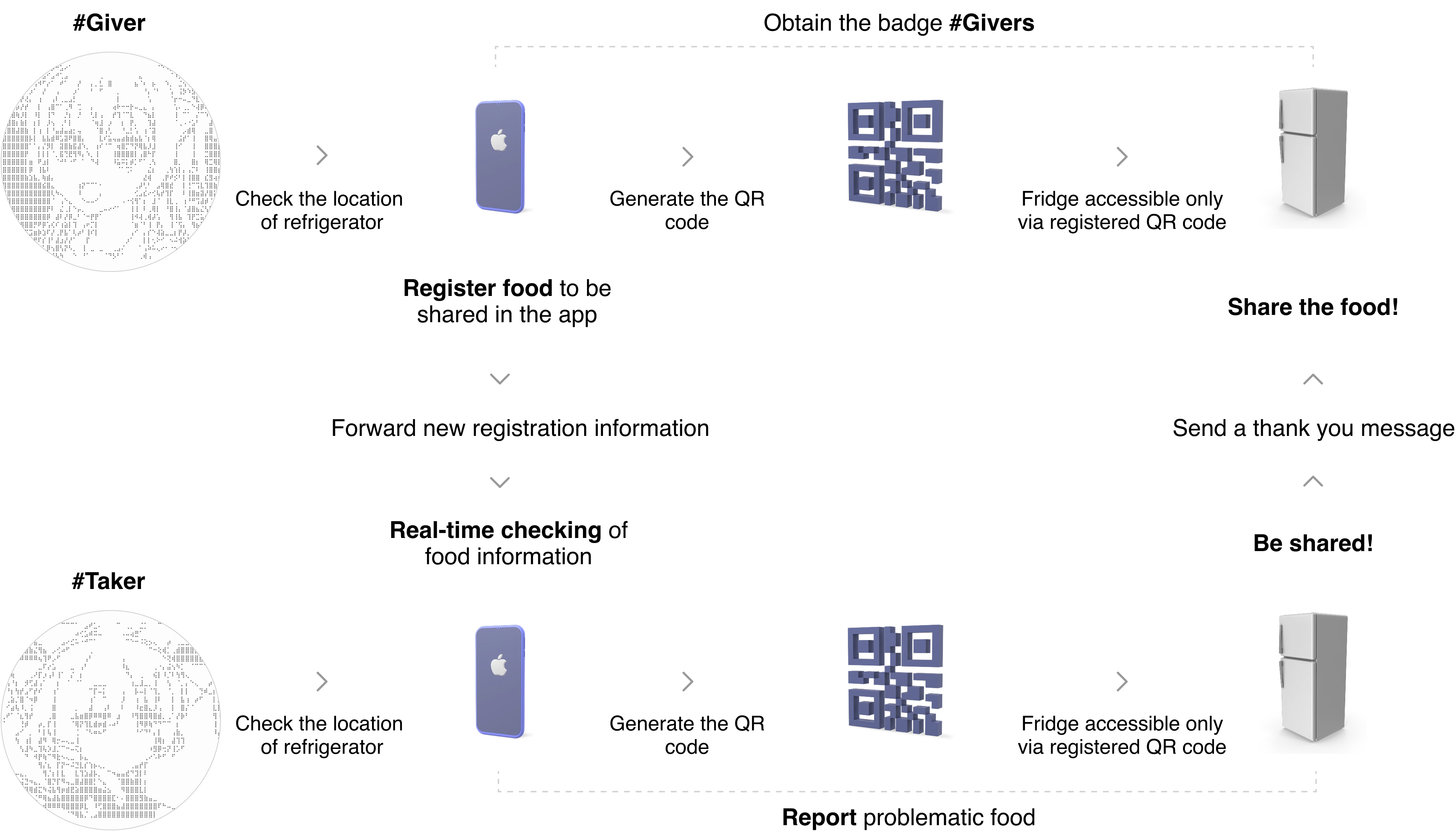
Enhancing freshness and security through a time-limited access flow
During the research, one key insight that emerged was that many users prioritize the freshness of the food above all else. Additionally, trust in the service was identified as a critical factor for users.With this in mind, a three-step process was introduced to ensure food remains fresh and secure throughout the sharing cycle.
First, users register the items they'd like to share. Then, once an item is registered, a freshness timer is automatically activated to maintain the food's quality. Finally, access to the refrigerator is restricted to authorized users through a unique QR code. This flow not only enhances the reliability of the service but also safeguards the quality of the shared food.
Encouraging sharing through the reward system
Many users expressed a sense of loneliness in their eating habits and a lack of people to share food with. To address this, the service incorporates a reward system that encourages small acts of generosity.
When users share food, they receive badges marked with the hashtag #Givers, fostering a light sense of community. Rather than treating food waste as something to discard, this system turns sharing into a meaningful interaction between neighbors.
Building accountability through communication
To strengthen the sense of community in the sharing process, a feature was introduced allowing users to send thank-you messages after receiving food. Additionally, a reporting system was implemented for users to flag any problematic items.
By enabling open communication, it directly addresses two key pain points: the loneliness users feel when eating alone and the importance of service trust, particularly regarding food freshness.
Takeaway
Working on this project reminded me that design isn’t just about creating screens — it’s about understanding people’s everyday struggles and figuring out how design can gently support them. One of the biggest challenges was narrowing down the scope. There were so many ideas and features I thought would be “nice to have,” but I quickly realized that prioritization is what truly matters. It helped me focus on the main design principles: trust, freshness, and small emotional moments.
At times, I questioned whether simple features like badges or thank-you messages could really make a difference. But the more I thought about the emotional gaps people were expressing, the more I came to believe in the power of small gestures that resonate. It was a meaningful opportunity to see UX not just as functional, but also as relational.
Lastly, since this was a personal project, I wasn’t able to take it as far as validating its business value or measuring its impact on user experience at scale. But if I ever get the opportunity to develop it further to test it with real users, refine it based on feedback, and explore its potential as a viable service, I’d be more than excited to see where it could go.