UI/UX design
Quantitative study
Gamification
AI Act Game
A user experience study of the AI Act Game to assess its usability, engagement, and educational effectiveness
Duration
5 months
Role
UI·UX Designer/UX Researcher
Background
The AI-Act Game, designed by Dr. Thomas Le Goff (Télécom Paris), is a web-based interactive game created to teach the public and legal professionals about the AI Act. The Act is a set of rules by the European Commission to ensure safe and responsible use of AI.
The game targets both legal experts and general users, who have very different needs. It is difficult to design an experience that works well for both groups without confusing or boring one side.
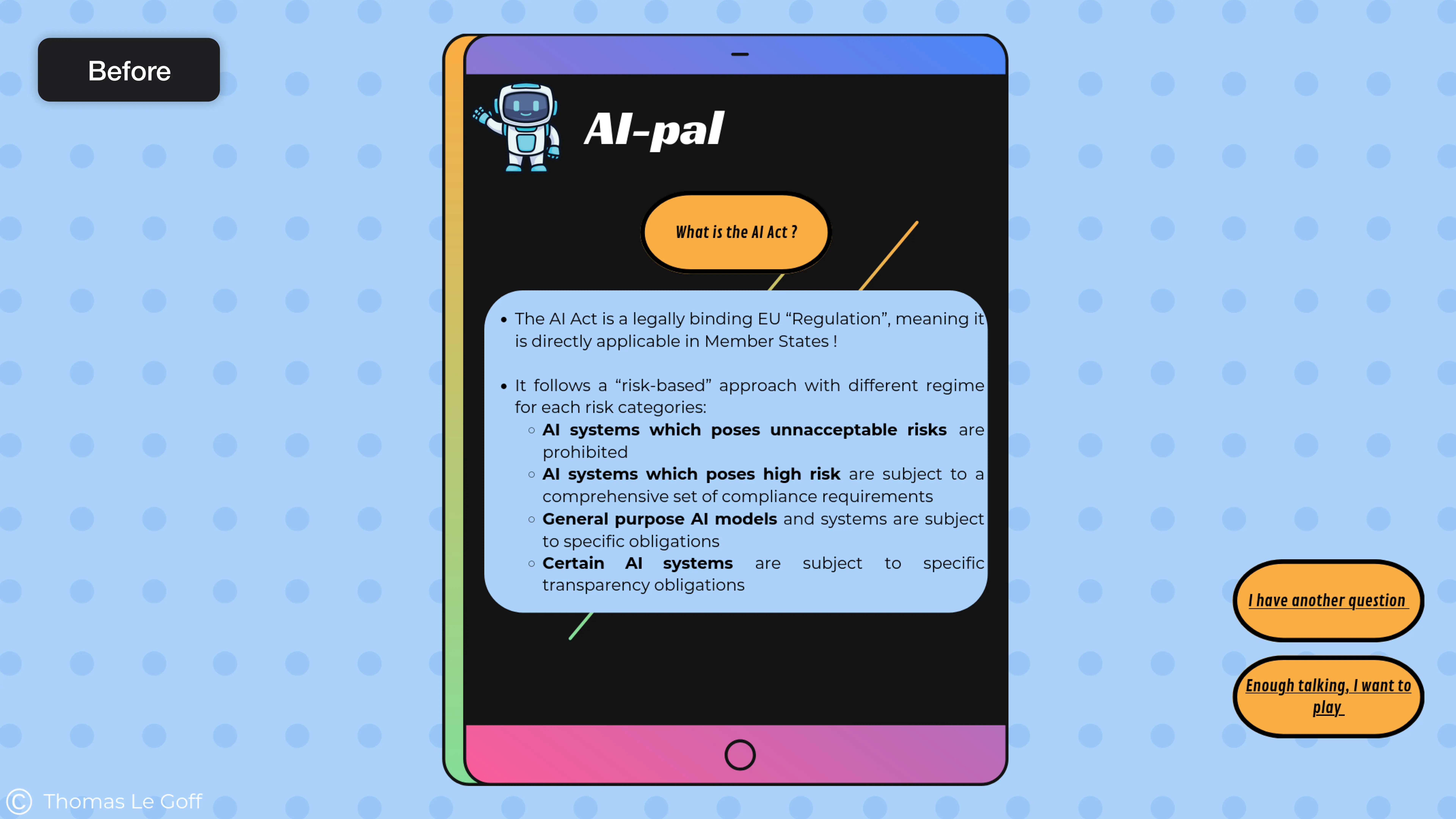
Users interact with various AI-related legal scenarios through a click-based interface. However the initial version relied heavily on dense text with minimal interactive elements.
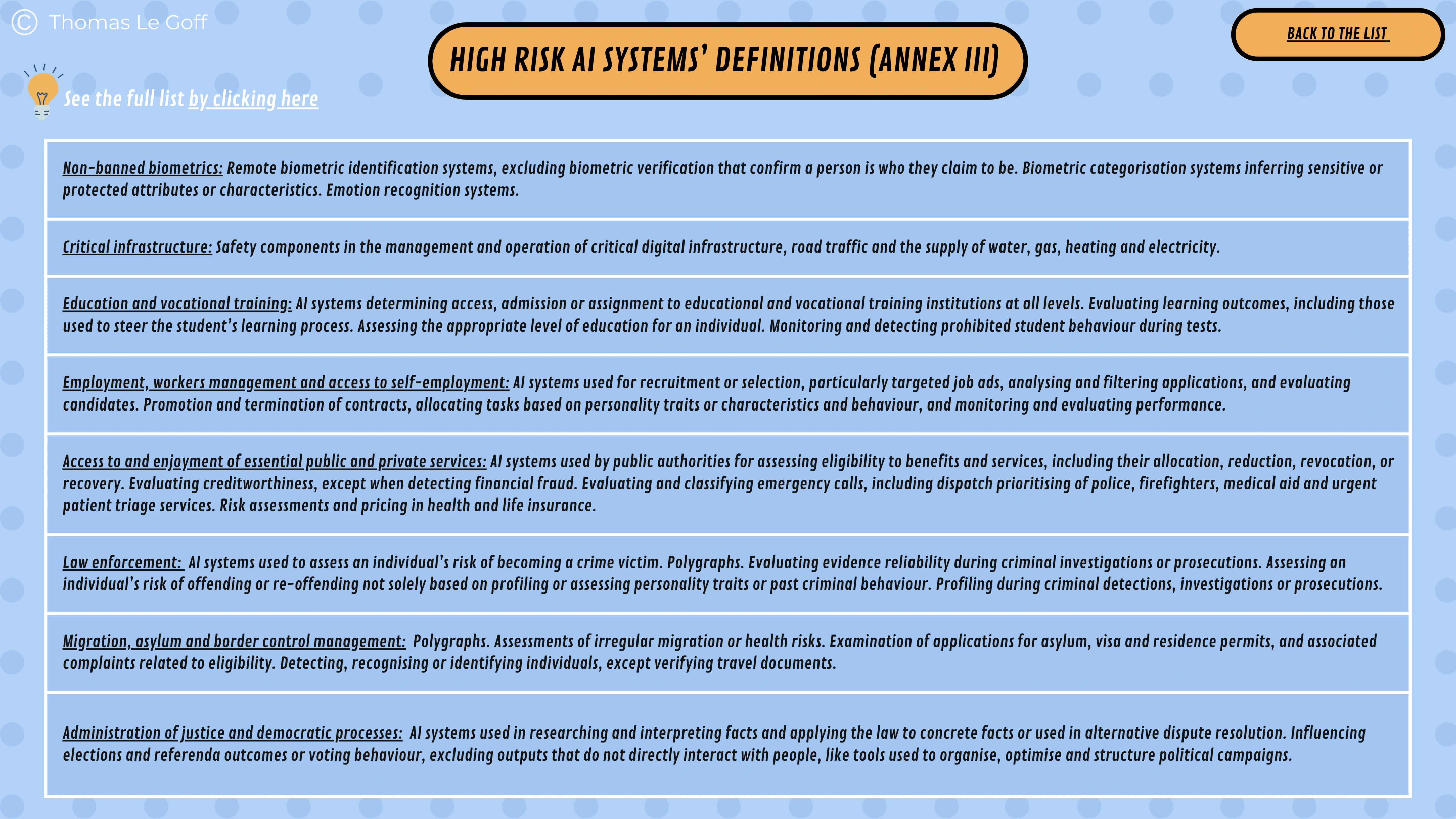
Users had difficulty processing the large amount of text.
Participants reported difficulty understanding and engaging with the large amount of text. The limited navigation and lack of game mechanics led to confusion and reduced user engagement.
Process
01
Identify
User journey map
02
Design
Prototype
03
Test
A/B Testing
Analysis
User journey map
In the early phase of the project, we created a user journey map to identify core issues. Based on these findings, we were able to determine the direction for improving the game.
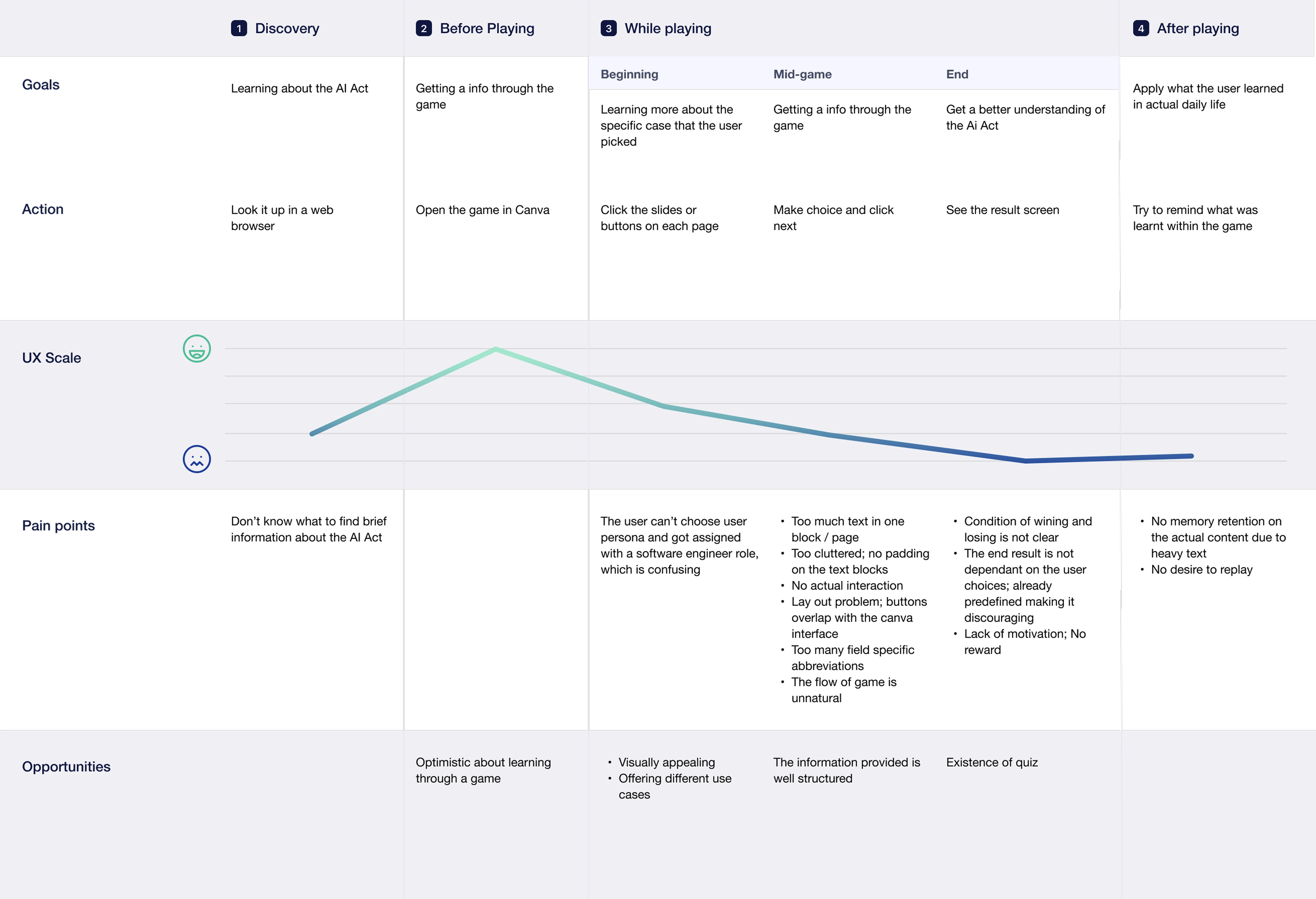
The followings are what we learned:
Research Insights
Users are being confused
01
They did not understand the overall game flow.
Users were often unsure of where they were within the game and struggled to grasp its overall structure. The absence of clear navigation elements, such as back and next buttons, added to their confusion.
02
They felt overwhelmed by the large amount of text.
The heavy use of text not only disrupted the flow of the game but also negatively affected users’ memory retention after gameplay.
03
The game lacked meaningful gamification elements.
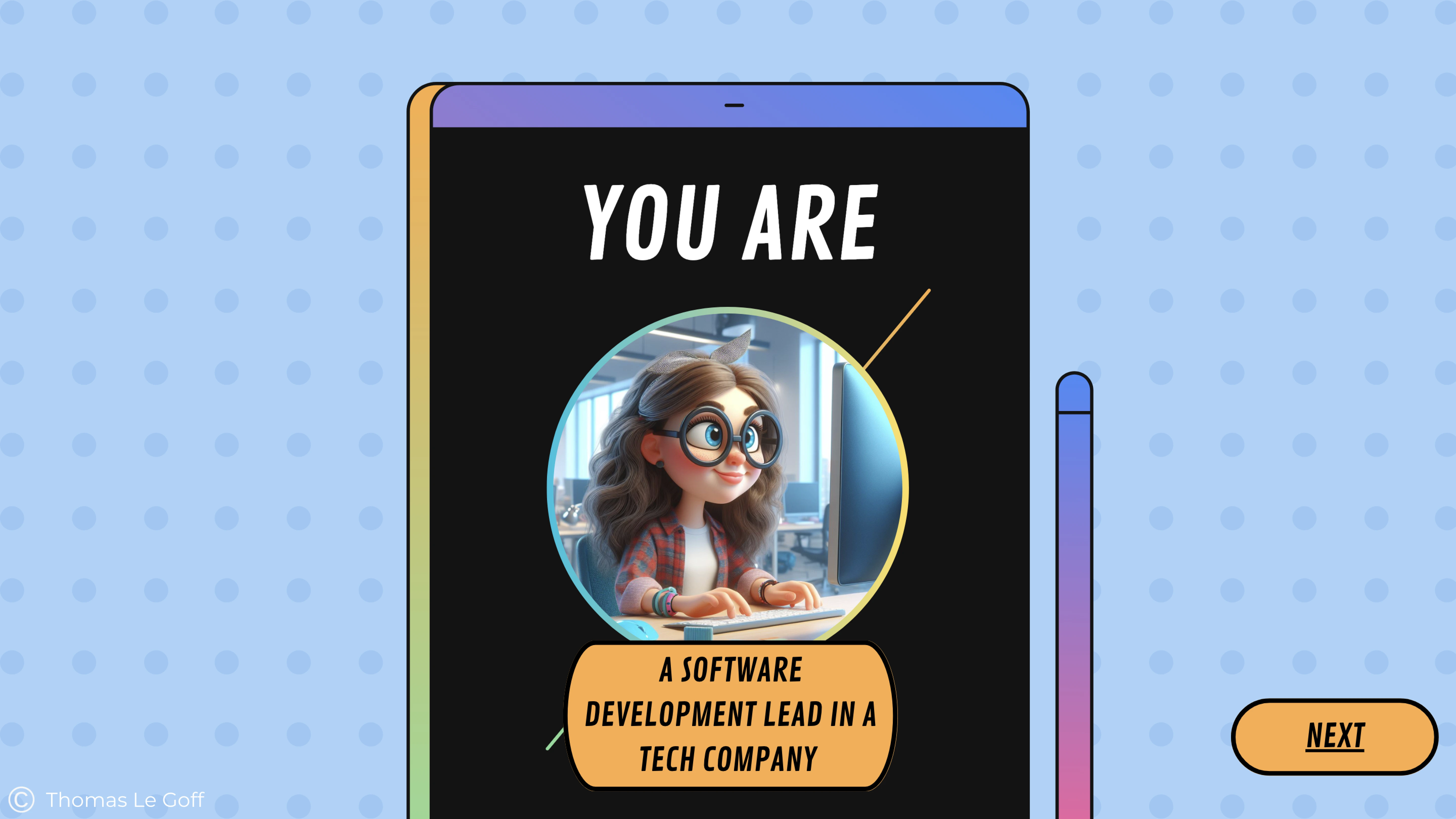
Users could not choose their own character at the beginning, and all interactions were limited to simple clicking. Additionally, the game provided no clear reasoning behind the final outcome, which made the experience feel less like a game and more like an interactive document.
Prototype
We identified the unclear game flow as the primary cause of user confusion. Therefore, we began by restructuring the overall framework of the game. A home screen was introduced as a central navigation point, allowing users to return at any time, and the experience was divided into two distinct parts: a tutorial and the main game.
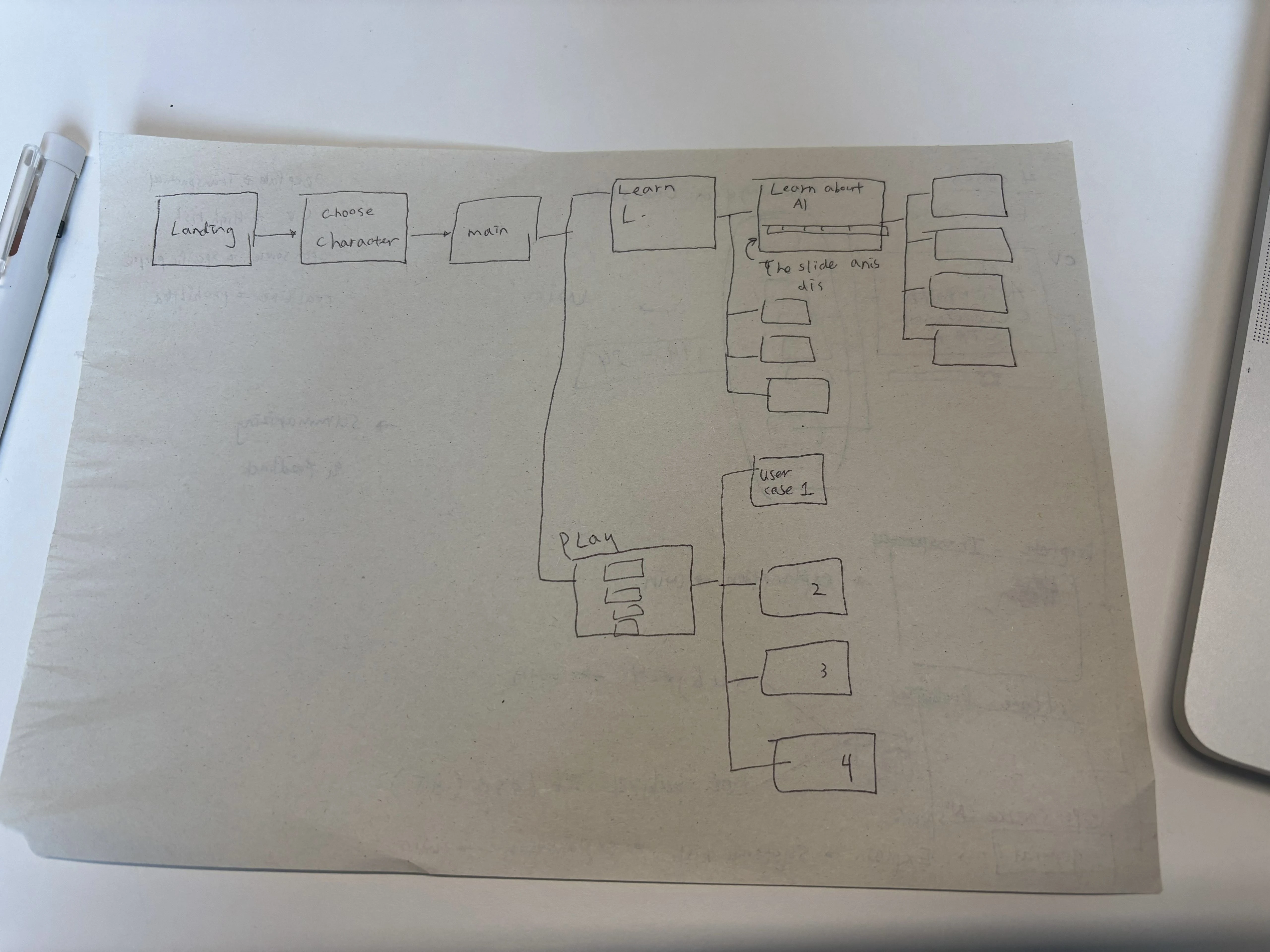
Next, we focused on creating a visually more appealing UI. This included breaking down large blocks of text across multiple screens to reduce cognitive load. We also added appropriate padding within each screen to improve readability.
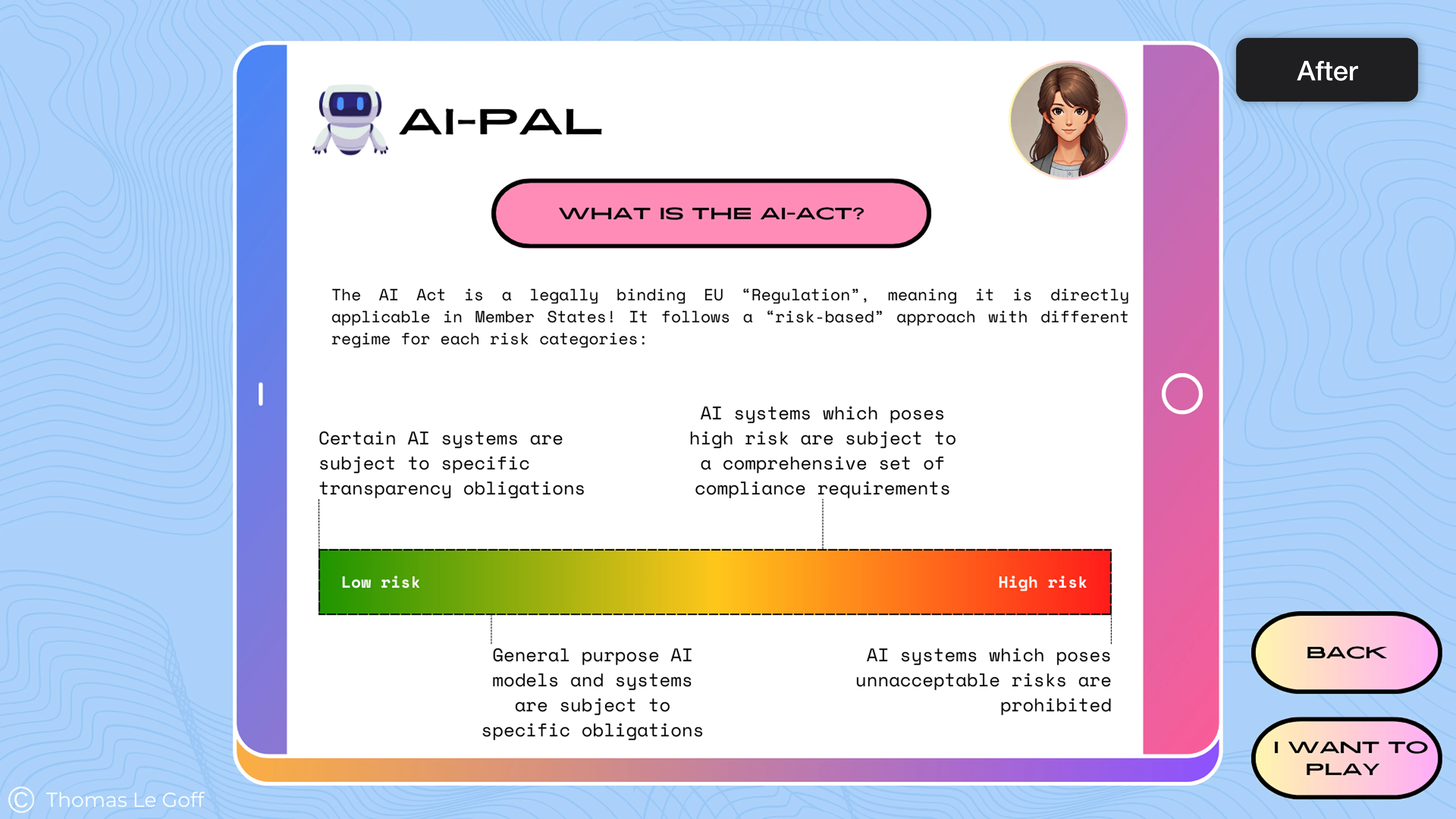
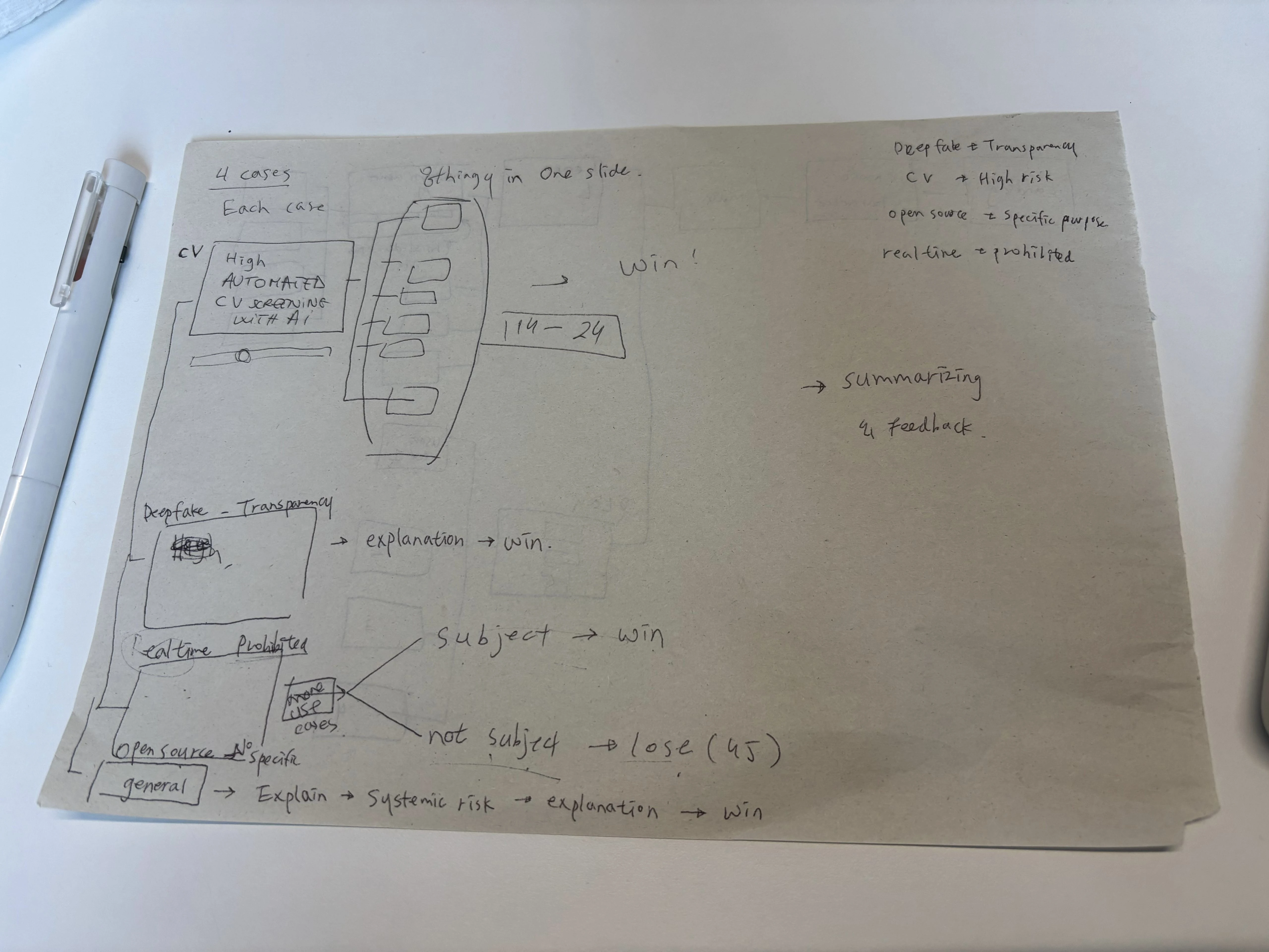
In the original version, concepts such as "low-risk" and "high-risk" systems were explained only through plain text. In the redesign, we introduced a visual spectrum—from green to red—to illustrate the range of risk levels, with corresponding explanations placed along the scale.
Finally, we incorporated more game-like elements. Users could now select their own character in the beginning. We also added interactive behaviors such as hover effects, long presses, and drag-and-drop actions to make the experience feel more engaging than simple clicking.
A/B Testing
To determine the effectiveness of the AI Act Game, the study employed an A/B testing approach. Mixed quantitative and qualitative methods were used, including quiz results analysis, usability questionnaires, heatmaps, think-out-loud sessions, and semi-structured interviews. The study aimed to identify design errors, user engagement, and the influence of interactive elements on comprehension.
Results
Heatmaps
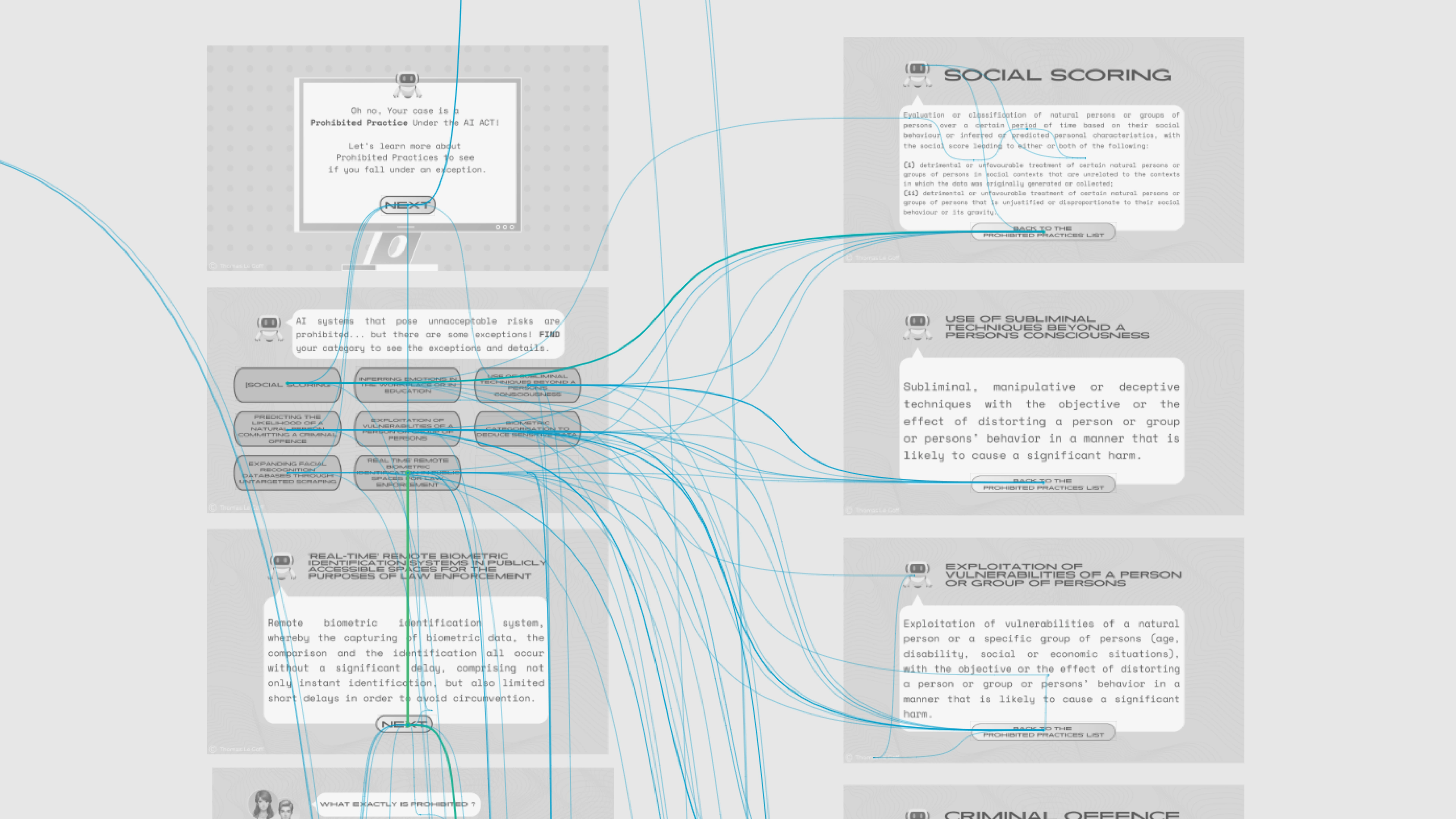
Before redesigning the presentation, we noticed that some elements looked interactive when they were merely decorative. This observation was confirmed by the study’s heatmaps, on this page for example:

Here, the character is assigned to the users. Clicks on the character icon and title suggest that the users thought they could choose it. There are also clicks on the phone’s stylus that lead nowhere.
In this case, the heatmaps of the results simply confirm the observations we made while playing the game ourselves. With these observations in mind, we’ve tried to limit the non-interactive decorative elements in the redesigned version. The heatmaps of the redesigned version show good results in this respect.
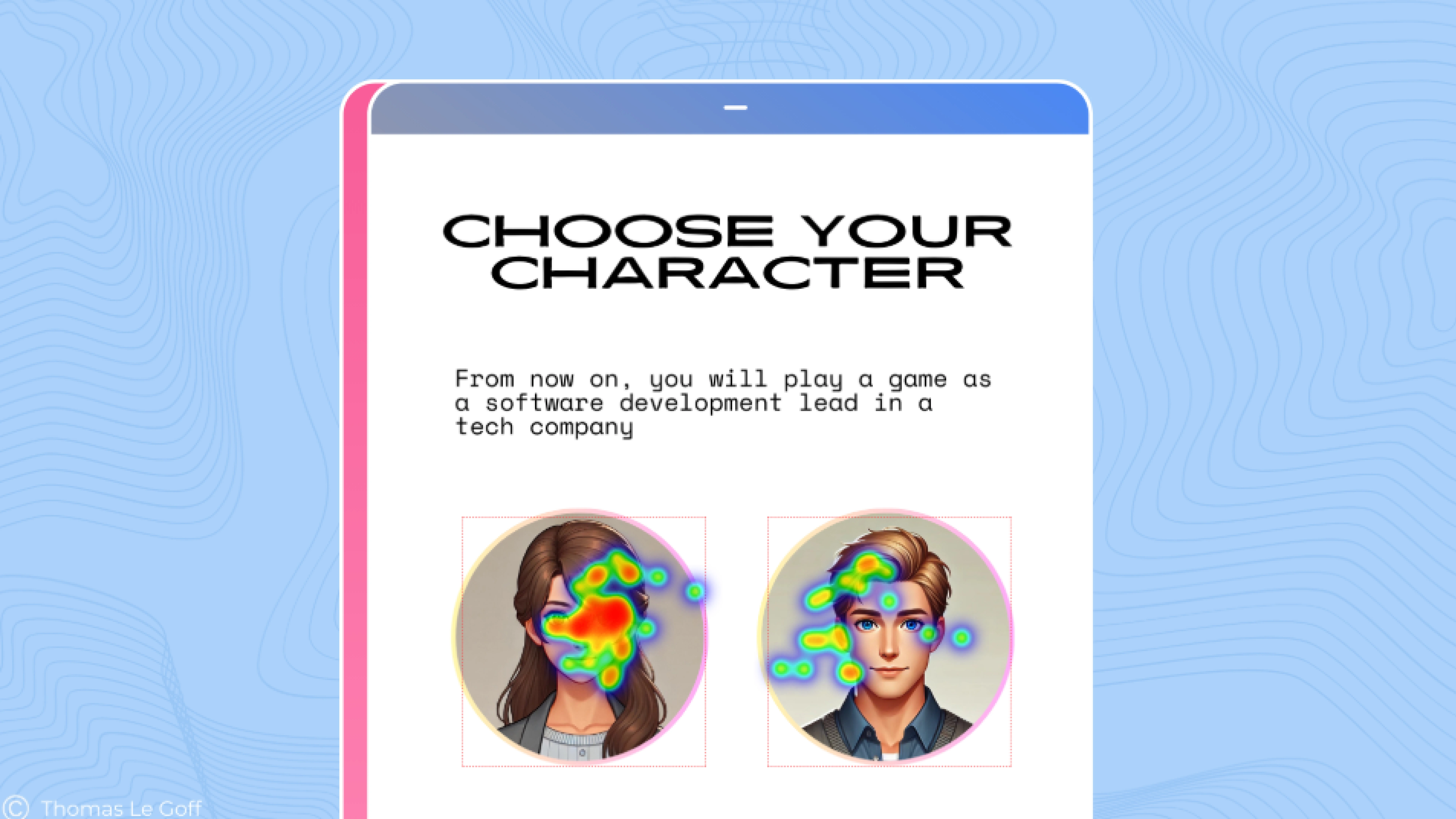
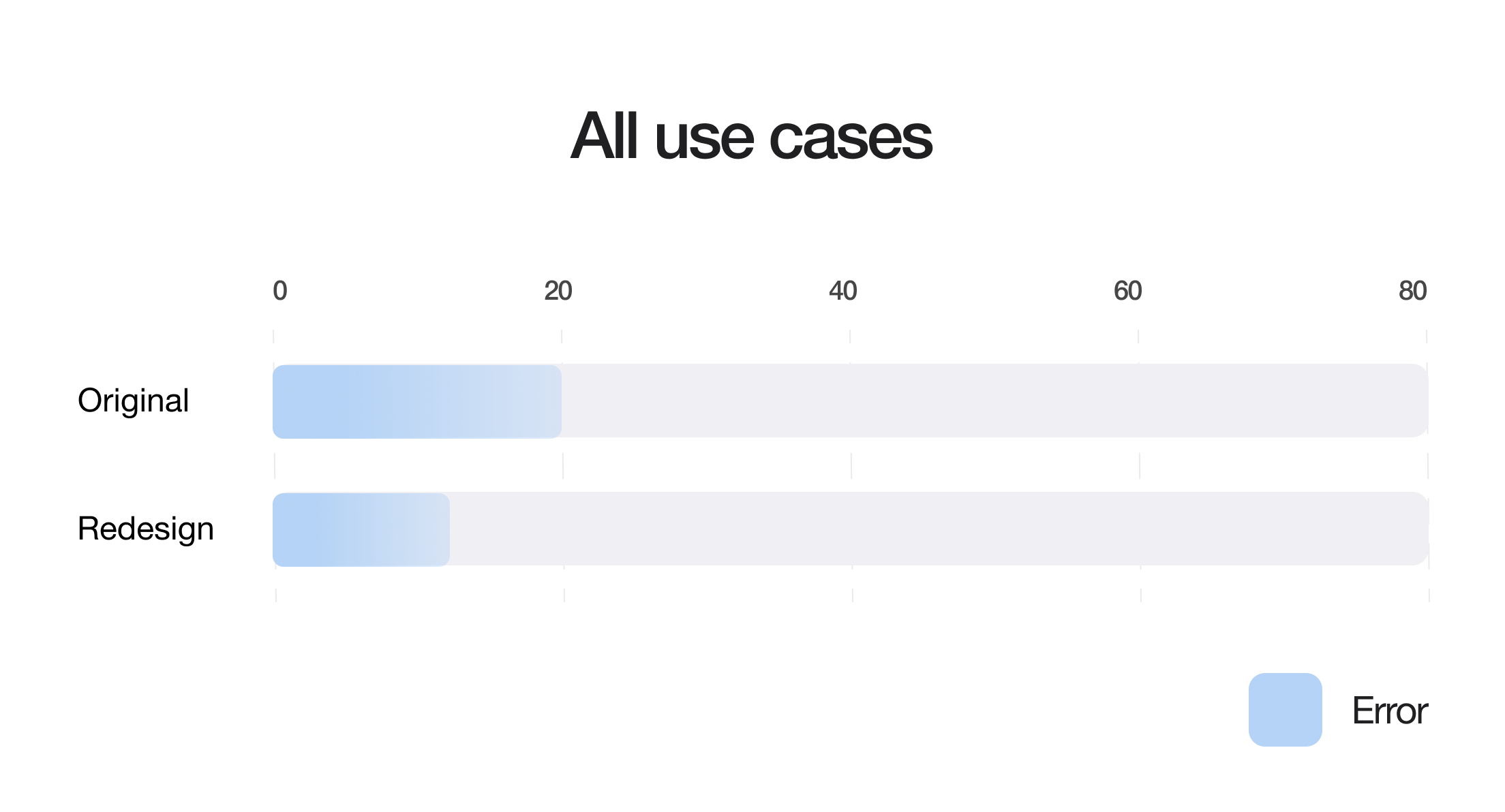
Overall, in the original version, 25% of clicks are not on an interactive element, when all the clicks are on a widget in the redesigned version.
User journey
A major point of confusion for us was on the following page, from the Real time facial recognition use case. At this point we were getting lost and did not know what to do in the game. We thought the issue was that several buttons were leading to the same page. The page in question was very compact in text area and the font was very small, which was adding to our confusion.
Our impressions were confirmed by the heatmaps again, where we see that instead of clicking on the button leading to the rest of the game, users were trying out different ones.
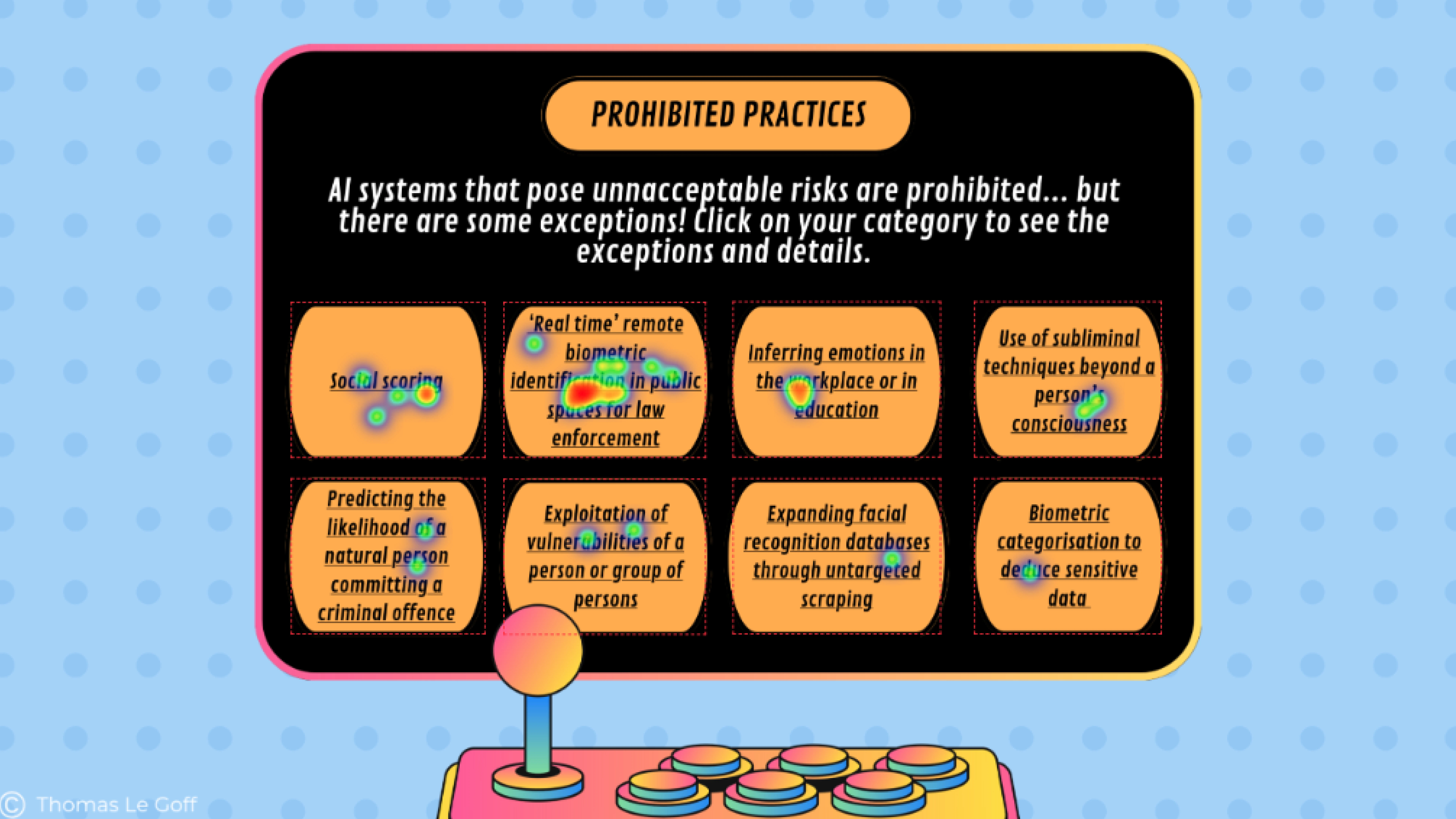
A major point of confusion for us was on the following page, from the Real time facial recognition use case. At this point we were getting lost and did not know what to do in the game. We thought the issue was that several buttons were leading to the same page.
Our impressions were confirmed by the heatmaps again, where we see that instead of clicking on the button leading to the rest of the game, users were trying out different ones.
We get a much better idea of the flow of the users when we look at the user journeys.
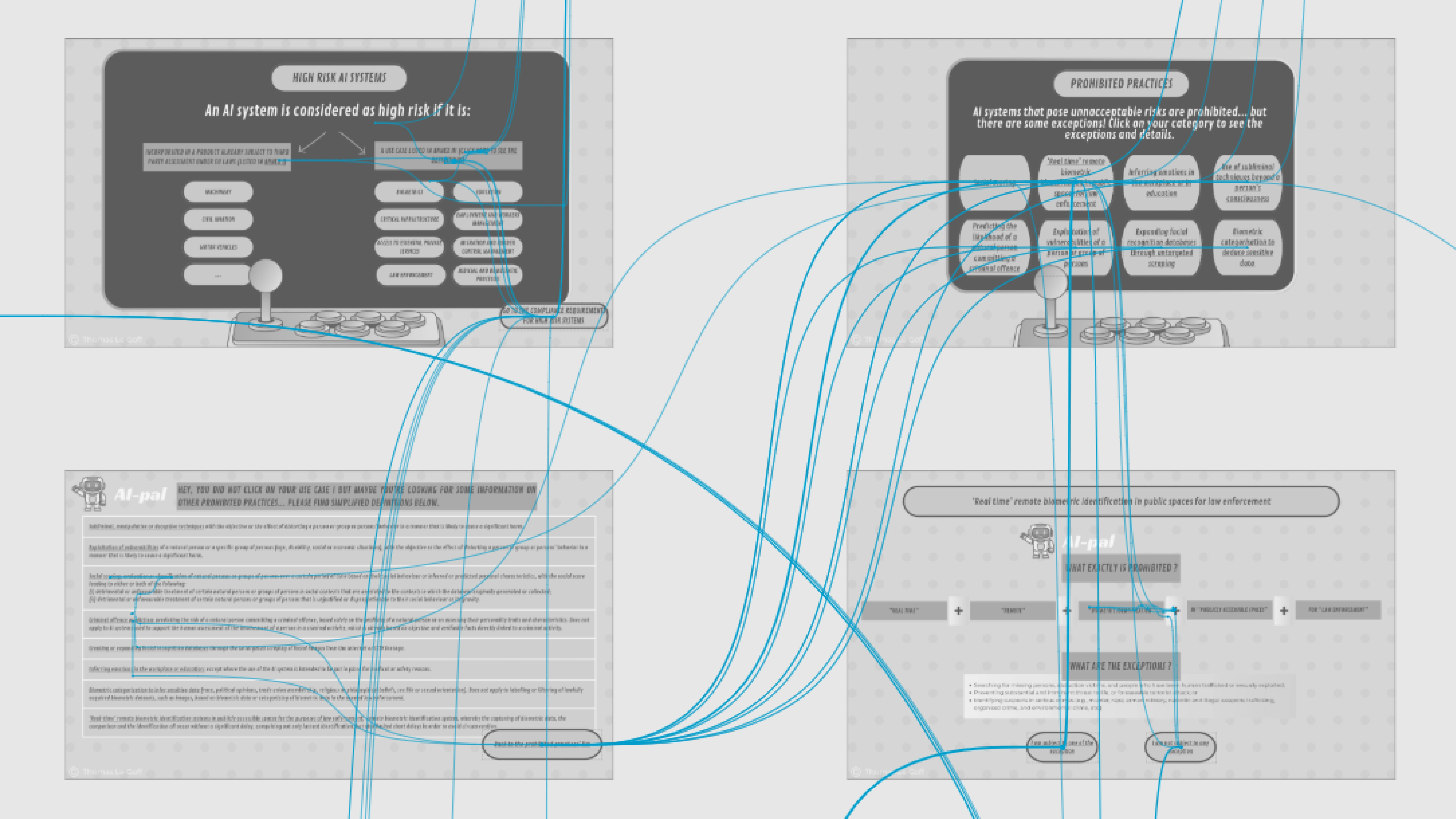
The “right” path to continue the game is the one following the vertical line. Instead, we see many diagonal lines from top right corner to bottom left, representing the going back and forth between the two pages shown earlier.
Spotting areas of confusion for the users was made easier by looking at these journey maps: multiple lines are easily identified and show areas of the game where the user is “stuck”.
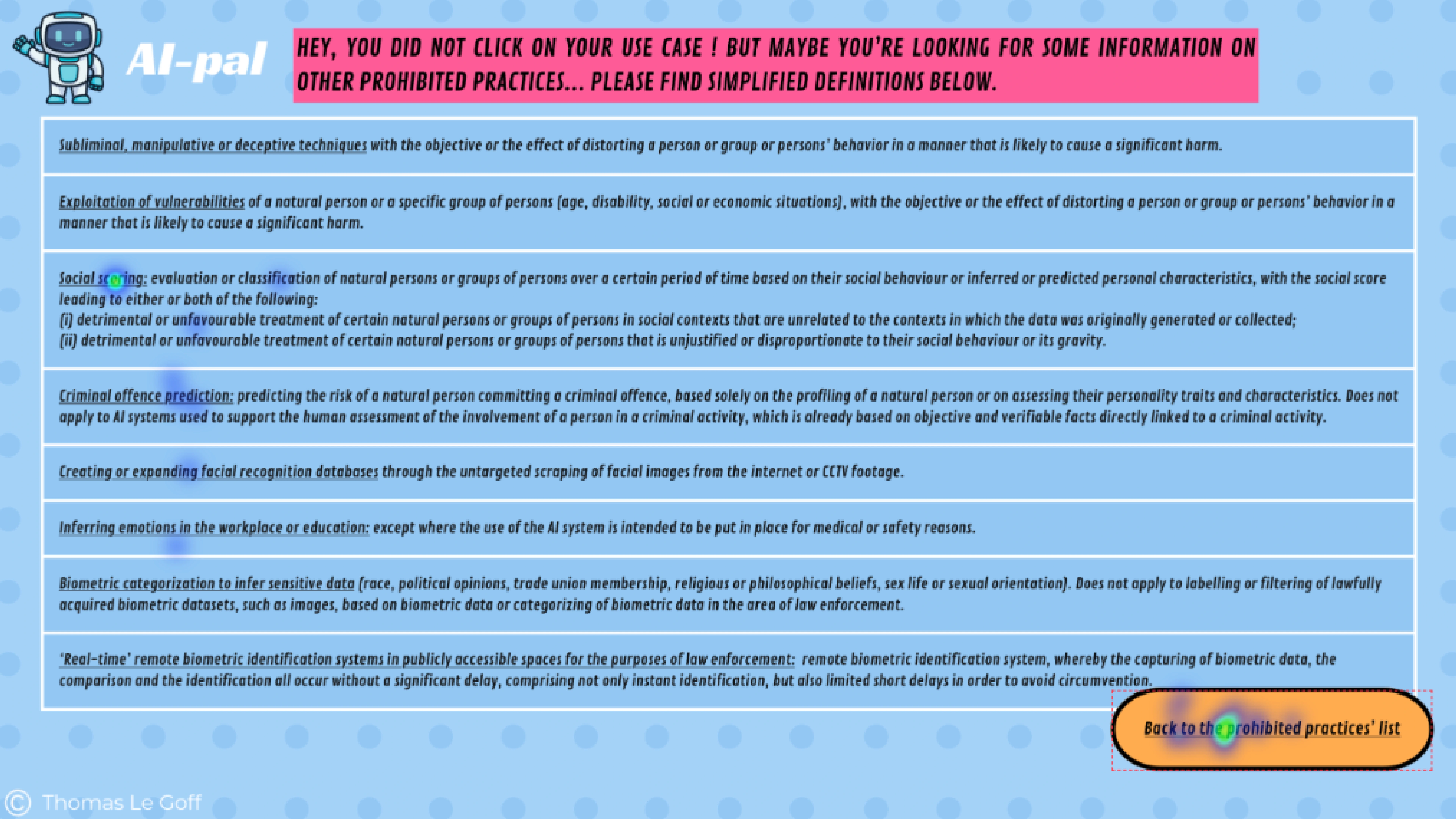
So, as we believed before the user tests this point of the game was confusing, we redesigned it so that each point would lead to individual pages. We split the landing pages into several ones: one for each prohibited practice. But it appears that the redesigned version was as confusing for users, as they were still going back and forth, this time between the individual pages…
Dwell time
As original and redesigned versions were both confusing points, we could compare the time spent on screen to assess which one was the most difficult for users.
This is how we learn that users spent twice as much time on the redesigned page than on the original one: on average, 12 seconds versus 6 seconds. Considering that the page is not an informative one, in the sense that it does not explain any concept from the AI Act, the time here was spent to progress in the flow of the game. The longer dwell time for the redesigned page therefore shows more confusion for the user.
Thinking aloud & semi-structured interviews
The thinking aloud allowed us to better understand what was the main issue in this section of the game. Many comments had in common that they showed users lacked clear instructions for continuing the game: they didn’t know what to do, nor did they understand the purpose or consequences of their actions.
“Is there a right answer and wrong ones?”
“Can I choose whatever I want?”
Or when arriving on the prohibited practice definition page:
“I don’t understand, what is this?”
“Do I need to read everything?”
“What is this document about?”
Contrary to what we thought, UI was not the most important. Users especially remember instructions, which are a priority for a good experience. In fact, users who didn’t have this use case gave much more positive feedback on their overall appreciation of the game.
Players who had no problems understanding the game – because they had a simpler use case – commented more on the aesthetics when we asked them about their immediate impressions after playing both versions. Here is an exerpt of the feedback of a user for CV Screening on original version and Open Source LLM on redesigned version.
“Original: “High text density led to fatigue.”
Redesigned: “Bright colors and the AI character (“AI Pal”) added a friendly touch.”
Conclusion
Combining the heatmaps, user journeys, clicking information, dwell-time and qualitative feedback from both versions, we could spot the points of confusion and understand their origin.
It was also interesting to do A/B testing, because having similarities and differences in the feedback from two different versions has enabled us to understand the origin of comprehension problems, as in the previous example where the instructions were not highlighted enough.
Information retention
Participants had more right answers on the quizz when testing the redesigned version.
After playing each case, we asked participants to answer a short quiz, to check what they remembered from the game. There was one quiz per use case, regardless of the version. The graphs below aggregate the answers from all participants for each use case.
Limitation
However, we don’t think we can draw conclusions from it because:
Most people were answering out of deduction, or just from one word they remembered reading.
The quizz is biased as some participants were already interested in the use case before playing, when others were just discovering them. People who had some knowledge about their use case remembered better the information.
We only have a poll of 20 participants so the bias cannot be ignored.
Insight
01
Need for gamification
Initially, our studies and participant feedback revealed a clear need for gamification. Participants consistently highlighted that gamification was more important than UI aesthetics, context, and flow. The current experience lacks essential game mechanics, such as progression, decision making, and engagement features. Without these elements, the experience felt more like an interactive document than a true game, leading to reduced engagement and less effective learning outcomes.
02
Unclear target audience
Additionally, we identified a significant issue with the unclear target audience. Survey responses from the System Usability Scale showed that 65% of participants needed additional support to navigate the game. The content and complexity did not suit either professionals or general users, legal professionals found it lacking depth, while general users found it overly complex. This highlights the need to clearly define the target audience and tailor the content accordingly.
03
Preference for new version
From the user experience questionnaire we got results that showed a preference for Version B, with an average score of 3.60 compared to Version A’s 3.14 where the lower scores indicated confusion. Despite this, Version B still faced challenges with usability, content clarity, and engagement, highlighting the need for a more streamlined and user friendly experience.
Based on our insights, a key recommendation for future work is to transform the experience into a true game by moving from Canva to a more suitable game design platform. Additionally, the content should be restructured to align with a clearly defined target audience for improved clarity. On a positive note, there is no need to redesign the game’s visuals, as our findings showed they had little impact on the user experience despite initial expectations.